From Client Artwork to a Working Tumbler Drying Base
A look at the design decisions behind branded drying bases created for Glaze Ranch Glitter and Melissa QCB, including artwork translation, stability, cleanup, and repeatability.
A branded tumbler drying base has two jobs at the same time. It must work as a shop tool, and it must present the maker's identity clearly enough to belong in photos, videos, and the workspace. If either side is ignored, the result becomes either a plain fixture with a logo attached or a decorative sign that is awkward to use.
AFK Model Forge built related drying-base designs for two tumbler creators: Glaze Ranch Glitter and Melissa QCB. The finished pieces use different artwork and shapes, but they share the same underlying design questions. This case study explains those questions without exposing private customer files or pretending that one geometry fits every maker's process.
Begin with the real workflow
The central post is the functional anchor. Its diameter, height, transition into the base, and surrounding clearance affect how the tumbler sits and how easily the tool can be handled. The post also creates leverage on the base, so the connection cannot be treated as a decorative afterthought.
Before styling the perimeter, we consider the expected tumbler opening, the working surface, how the piece will be picked up, and whether wet coating can reach areas that are difficult to clean. A broad base improves stability, but unnecessary area adds print time and consumes workspace. The useful shape is the smallest one that remains comfortable and steady for the customer's routine.
Translate artwork instead of tracing it blindly
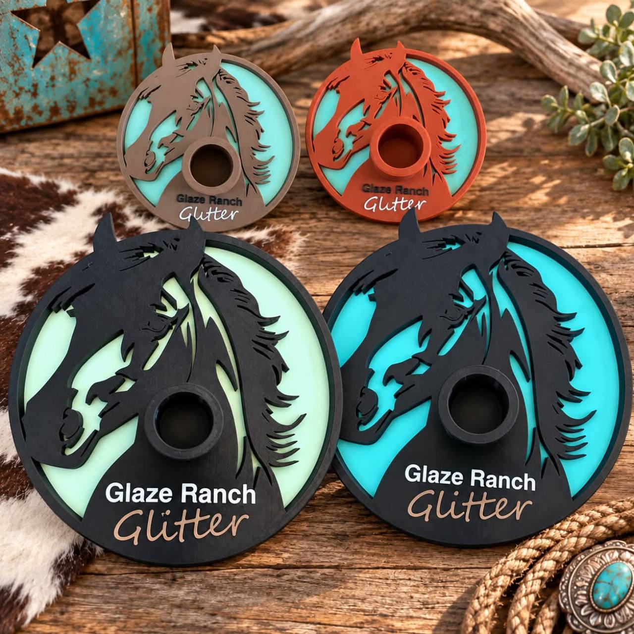
The Glaze Ranch Glitter pieces use a horse motif, layered color fields, and the business name. The Melissa QCB pieces use giraffe artwork with narrow spots, facial features, a border, and an oval silhouette. Both designs begin with recognizable brand imagery, but a printable surface is not the same as a screen or a full-color photograph.
Very thin islands, tiny gaps, and fragile points can disappear or detach when turned into physical layers. We simplify where needed, preserve the features that make the artwork recognizable, and check every region in the slicer. The goal is not to remove personality. It is to make sure the personality survives manufacturing.
Lettering receives the same treatment. A script word can look elegant on screen while its thinnest strokes fall below a dependable extrusion width. Small counters inside letters can close. Long unsupported flourishes can lift or become sharp. We balance type size, stroke thickness, contrast, and placement around the functional post.
Use color as structure and communication
The Glaze Ranch versions demonstrate how a repeated design can support different palettes while keeping the same visual identity. The dark foreground creates a strong silhouette against mint, turquoise, or other contrasting fields. The business name remains readable because the color relationship is planned rather than left to chance.
Color changes also have a manufacturing cost. Each change can add time and purge material, especially when colors alternate across many layers. Whenever possible, we organize visual regions so the result is clear without creating needless swaps. A separate top layer, a controlled set of color bands, or a small number of meaningful accents often communicates the brand better than a highly fragmented color map.
Design for cleanup and repeat use
A shop tool will collect dust, coating residue, and handling marks. Deep decorative pockets may look dramatic but can become difficult to wipe. Sharp interior corners can trap material. Raised artwork needs enough support beneath it to survive repeated handling.
We consider whether the face can be cleaned, whether the perimeter has uncomfortable points, and whether the post leaves enough access around the artwork. The final object should not ask the customer to protect it like a display model. It should be ready to work.
Check the base as a physical system
The slicer preview confirms whether artwork and text exist, but it cannot replace physical judgment. We review the footprint, center of gravity, post connection, wall layout, top and bottom surfaces, and the layer direction around stressed areas.
For repeatable production, the design should also have a clear orientation and an understandable color plan. A custom piece that can only be reproduced from someone's memory is not a finished production asset. We keep the manufacturing intent tied to the model so another approved copy can be made consistently.
What changed between clients
The Melissa QCB design uses an elongated oval to suit the giraffe composition. The neck creates a natural vertical path toward the functional post, while the border contains the artwork and gives the light-and-dark design a finished edge.
The Glaze Ranch Glitter design uses a circular base and a horse silhouette that wraps around the post. The larger versions create room for the business name and a layered background, while the smaller versions show how the same identity can be adapted when the footprint changes.
Those differences are the point of custom work. We reuse the design discipline, not the customer's branding. Each commission receives its own approved imagery, proportions, and production file.
Our branded shop-tool checklist
- Confirm the tool's working dimensions before decorating it.
- Use artwork the customer owns or has permission to reproduce.
- Identify the few visual features that make the brand recognizable.
- Thicken or simplify details that will not survive the planned nozzle and layer height.
- Check lettering and isolated color regions in the sliced layers.
- Keep the object stable, comfortable to handle, and reasonable to clean.
- Reduce color changes that add waste without improving the design.
- Save an authoritative production file with the intended dimensions and color plan.
- Photograph the completed work only with the client's approval.
The result
These drying bases are evidence of the work AFK Model Forge is trying to do well: take a real small-business need, preserve the owner's visual identity, and turn both into an object that earns space in the shop. The finished photos matter because they show the gap between a concept render and an actual printed tool.
For a new commission, we start with the intended use, dimensions, approved artwork, color preferences, quantity, and deadline. From there we can determine whether the project needs a new model, an adaptation of a customer-owned file, or a simpler production solution.
Common questions
Can AFK Model Forge reuse another client's branded design for me?
No. The production discipline can be reused, but client artwork and branding remain specific to that customer. A new commission needs its own authorized artwork and approval.
What do you need to quote a custom drying base?
Provide the intended working dimensions, how the tumbler interfaces with the post, approved logo or artwork files, preferred colors, quantity, and deadline.
Can every logo be printed exactly as supplied?
Not always. Very thin strokes, tiny gaps, isolated details, and complex color maps may need careful adaptation so the physical result remains recognizable and durable.